

 https://www.rapinteriors.co.uk/wp-content/uploads/2019/10/school-art-classroom-design-with-colourful-storage-units-750x500.jpg
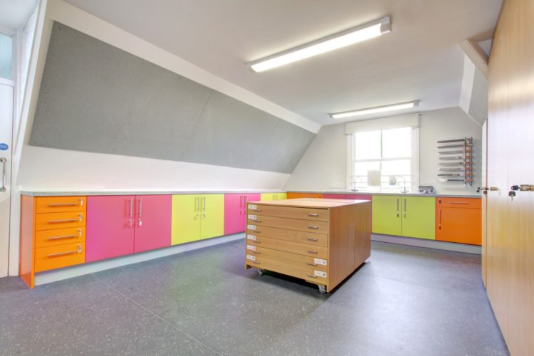
school art classroom design with colourful storage units
https://www.rapinteriors.co.uk/wp-content/uploads/2019/10/school-art-classroom-design-with-colourful-storage-units-750x500.jpg
school art classroom design with colourful storage units
We specialise in creating education and school interior design schemes that galvanise staff and inspire students to engage in study. Our modern, practical and fun interior designs have helped countless students to reach their full potential, putting them on the path towards a successful future.
When you’re in the planning stages of your school refurbishment project, choosing a colour scheme is easier said than done. Do you just go for a neutral white to please everybody? Or do you let the kids decide and go for something bright and colourful?
It’s hard to know where to begin but there are a number of determining factors that can help to narrow down your search. Let’s take a look at some of the important things you will need to consider when considering colour schemes for your school…
 https://www.rapinteriors.co.uk/wp-content/uploads/2019/05/a-modern-school-classroom-design-with-a-whiteboard-and-a-reading-area-for-children-750x499.jpg
a modern school classroom design with a whiteboard and a reading area for children
https://www.rapinteriors.co.uk/wp-content/uploads/2019/05/a-modern-school-classroom-design-with-a-whiteboard-and-a-reading-area-for-children-750x499.jpg
a modern school classroom design with a whiteboard and a reading area for children
When looking at colour schemes for your school interior design, the children’s age is an important consideration.
Young children at primary school age are attracted to warm, lively colours. Reds, oranges and yellows are examples that can be interpreted as bright and cheery.
We designed and delivered a vibrant, colourful and fun classroom fit-out for Holy Trinity Lamorbey. We configured the space to contain a central learning area, a reading zone and a section for teachers to conduct lessons.
The colour schemes were chosen to classify the year groups; yellow walls for primary classrooms and red walls for reception class.
Older children react better to blue, coral reds and violet blues. These colours are good for social areas to create inspiration and imagination. Violet blues open both sides of the brain, logical and creative, and it’s found that students often do their most interesting work when colours are present.
Purple is usually embraced when the mind develops social awareness and outward thoughts promoting intuition and insight.
Colour has great importance in enhancing memory performance and visual sense in order to achieve a positive response towards learning, reducing boredom and increasing attention spans. However, too much colour can over stimulate instead of inspiring so you need a good balance between bold and neutral colours.
Too much of one colour might also be ineffective as being surrounded by one bold colour can lead to overstimulation while an all-white room, in contrast, can result in boredom and introversion.
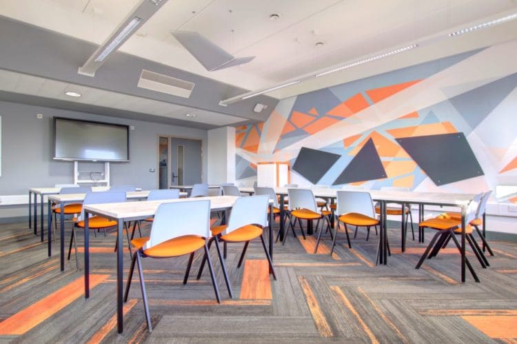
Therefore, it is best to take the edge off with a supporting colour (white being a classic example) to create the perfect balance, as featured in Haringey’s Sixth Form IT Suite with their use of yellow vs white.
 https://www.rapinteriors.co.uk/wp-content/uploads/2021/11/Maths-classroom-design-and-furniture-at-Haringey-Sixth-Form-in-London-750x499.jpg
Maths classroom design and furniture at Haringey Sixth Form in London
https://www.rapinteriors.co.uk/wp-content/uploads/2021/11/Maths-classroom-design-and-furniture-at-Haringey-Sixth-Form-in-London-750x499.jpg
Maths classroom design and furniture at Haringey Sixth Form in London
Educators need to use more attention-grabbing colours to encourage learning, focus, alertness and awareness. Each subject is different and therefore you should select colours based on the unique impact they have on students.
School libraries are an extended learning environment and therefore the colour selection is very important. Colour choice in a library setting should be used to align emotions and behaviours with the purpose of the space.
Generally, different areas of a library are intended for different activities as an extension of the learning environment:
We transformed the library at Southmead Primary School into a fun and inspiring enchanted forest, complete with an artificial tree and log stumps for students to feel more productive in their reading and learning.
We bought the outside in with the green textured carpet, wood furniture and soft furnishings mimicking the natural features.
 https://www.rapinteriors.co.uk/wp-content/uploads/2019/06/a-3D-render-of-a-school-library-with-furniture-and-a-book-shelf-750x372.jpg
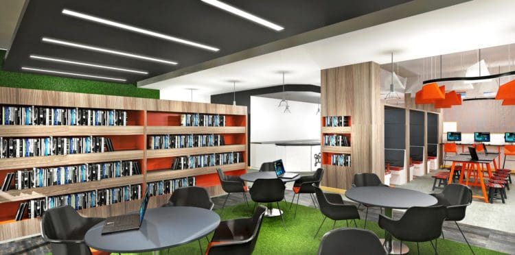
Laptop Station Interior Design for Haringey Sixth Form College in London – Rap Interiors – Interior Design Company
https://www.rapinteriors.co.uk/wp-content/uploads/2019/06/a-3D-render-of-a-school-library-with-furniture-and-a-book-shelf-750x372.jpg
Laptop Station Interior Design for Haringey Sixth Form College in London – Rap Interiors – Interior Design Company
For many sixth formers, hanging out in the common room is the best part of coming into school. Given that the common room is a place full of conversation and fun, the excitement should be reflected with bold, energetic colours.
Orange, for example, is a great colour for common rooms as it is warm and welcoming. To avoid overkill, a great idea is to go for neutral walls and compliment them with funky orange school furniture.
Haringey Sixth Form College contacted us to create a cutting edge learning centre for its students.
The upgrade included the creation of an IT Suite, research area and breakout space; design overhaul of the existing servery and presentation area, and additional works throughout the space to ensure it was bright and colourful as well as functional.
85% of autistic children see colours with greater intensity, so it is crucial that you consider this before starting your school refurbishment.
The creation of sensory rooms in schools is a practical and effective way to provide a calm and safe space for students with autism. In terms of the colours you should avoid, red and white are big no-no’s. Red can make an autistic child feel angry and can even cause them pain while an overwhelmingly bright white room can hurt their eyes.
For a much safer alternative, try more muted, cooler and calmer colours like blue, purple and green. Pale pink has been demonstrated through tests to be soothing too. Warmer colours such as brown and orange are preferable too as they make a child feel warm and cosy. A monochromatic colour scheme could also be considered.
We created a sensory pod at East Kent College in Broadstairs, Kent with gradual colour changing and calming lighting options combined with soft seating in blues and greens for comfort.
This sensory pod created a calm and soothing learning environment and where the pupils could feel safe, without distraction or feeling any negative emotion.
Making sure the impact of the design has a positive effect on how a child feels has a domino effect on their productivity and learning capabilities.
If you need a reliable, experienced and professional education and school interior design company. We can help you create a stunning design, fit-out and refurbishment solution for your school. We have offices in Brighton, London, Croydon and Kent, providing solutions for schools across the UK.
To arrange a free consultation, call 0333 600 1234 or fill out the form below.
Enter your details below and one of the team will contact you to discuss your requirements.
 https://www.rapinteriors.co.uk/wp-content/uploads/2022/01/Office-boardroom-interior-design-for-a-Kent-property-developer-750x1125.jpg
Workspace interior design with acoustic elements
https://www.rapinteriors.co.uk/wp-content/uploads/2022/01/Office-boardroom-interior-design-for-a-Kent-property-developer-750x1125.jpg
Workspace interior design with acoustic elements